The power of Photoshop displacement maps.
Some possible uses
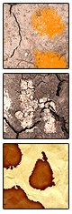
Text or symbols painted, burnt, branded, lit (light-projected) onto surfaces.
The type of effect is controlled by the layer blending mode, colour of text/symbol and layer-blending options, discussed later in this tutorial.
As so often happens, when working on a design for a client, you discover things by 'happy accident' (and then end up not using it anyway). Nevertheless, it's a useful effect and a good one to keep in mind.
The technique makes use of Photoshop's under-used 'displacement map' filter. This takes the 256 greyscale values of an existing Photoshop image, and applies them to your target layer. Greyscale values less than 128 result in a negative shift, greater values a positive shift. You can control the degree of horizontal and vertical shifting.
One of the reasons the filter is under-used is it's difficult to get it to do anything meaningful, unless you have a specific objective in mind. The techniques success is dependent on the quality and nature of the texture image you're using. The texture needs to make sense with the overlayed image or type, should be square on to the camera (unless you're planning to perspective-distort everything) and shouldn't have too much contrast.
First, we'll take some text, the word 'dirt' and displace it with, and then map it onto an image of some cracked earth.
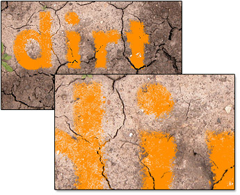
Download the background texture and open it up in Photoshop. This image is a bit too large for our purposes, so resample it to 1600 pixels wide, and save the Photoshop document as dirtbg.psd. We'll use this Photoshop file for our displacement in a minute, so don't save any other changes to it, until after we've displaced our text. You could use a separate copy of the file if you like. A zoom level of about 50% is ideal for this image.
Select the Text tool, and set the font to something very bold — I've chosen FuturaA Heavy, but you could use Arial Black or any other heavy-weight font. Pick a font size appropriate to your image — here it's 120px (Photoshop has preserved the import-resolution of this file as 300dpi, which affects the apparent size of the font).
Place your text so as to avoid any areas where displacement would be inappropriate — in this image, we're avoiding the small plants. Keep it away from the edges as well to avoid the displacement distorting over the edges.
Don't worry too much about the font colour — you can change it later by using the 'Colorize' function of a hue/saturation adjustment. I've chosen 50% grey as a good starting point, as it gives you flexibility to experiment with layer blending.
Now, we're ready to work some displacement magic. Ensure your text layer is selected, and that you're happy with the text, it's size and position, as we won't be able to edit or move it later. Select Filter - Distort - Displace. Photoshop will warn you that you're about to Rasterize the text, click Okay. The Displace dialog will open giving you the opportunity to select the degree of distortion required. Ensure 'stretch' and 'repeat' are selected below. The degree of distortion required is dependent on the amount of contrast in the image, as well as the size of the image. The more contrast, the less distortion is required. Here, we're using a value of 25%. Click okay, and Photoshop will Prompt you to choose a displacement map — this is the texture image that we've already saved(dirtbg.psd). Select this, and click on okay.
To get the 'orange painted look', from the gray, distorted text layer, change the layer blend mode to Normal and 100% opacity. Press CTRL-U to bring up the Hue/Saturation control. Tick colorize, and select a Hue of 34 (Orange) and as saturation of 100 for full-on orange.
More about layer blending
We're telling the top layer to allow the underlying layer to show through. By ALT-dragging, we create a smooth transition for both the dark and light areas of the background. The narrower the range, the more 'granular' the transition, the wider the range, the smoother the transition.
For extra realism, if this were paint, it shouldn't affect the dark cracks. Double click on the text layer, to bring up the layer blending options. We'll also allow some of the lighter areas of the background to 'poke through' the painted text.
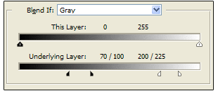
Drag the black slider to 100, then ALT-drag the black slider back down to 70. Drag the white slider to 200 and ALT-drag it right to 225.
You can play with the text layer's blend mode. Colour burn, Linear burn and Multiply will give you dark text; Colour dodge, and linear dodge will yield light text. Soft light, hard light, linear light will have no affect on the mid-gray text. Experiment with changing the text colour (quick tip, select the text layer, and use Image — adjust — Hue/Saturation. Click on colorize, and you can lighten/darken the text, shift it's hue and alter it's saturation).
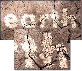
Here, we kept the text grey, and chose linear dodge to give a luminous, projected look. Again, the layer blending options have been set to allow areas of white and black to show through from the background.
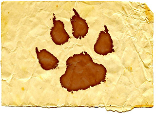
In the image above we have used a paw-print symbol (one of Photoshop's default vector shapes), set to the a purplish brown (colour: A66B71), distorted it by 50% because of the low-contrast background and chosen Linear Burn, to 'brand' the image into the background.
Resize the background to 800px wide, and save it as paper.psd. Set the foreground colour to A66B71. Select Photoshop's shape tool, and pick the paw-print. Create the paw print slightly right and down from the centre of the image, as the displace tool will move it left and up. Displace it by 50% as the background is quite low contrast. If the distorted image breaks up, try making it smaller, or moving it slightly lower down, and further right before distorting it.
As an extra touch, Right-click on the distorted shape layer, and click 'Select layer transparency'. From the menu click 'Select - Modify - Border' — 16px is about right. Feather the selection by 6px. Press CTRL-J to duplicate the selection into a new layer, which will inherit the previous layer's blending properties of linear burn, and give a darker edge fringe.
 Follow us on Twitter