Web design colour scheme generator
The Colour Wheel — a quick guide to colour schemes
The most often used schemes are:
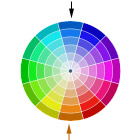
Complimentary colours — the opposite side of the wheel from your selected colour. Hard effect, high contrast, ideal for accent colours.
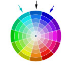
Analogous colours — the neighbours on either side of your selected colour, softer effect, lower contrast.
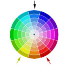
Triangle or Split Compliment — the colours either side of the complimentary colour, forming a triangle with the selected colour.
Use shading/saturation variants from any wheel in the scheme to go with your chosen colour segment/segments.
Having never been particularly happy with the tools out there on the web for choosing colour schemes, we decided to develop our own. Our favourite colour system is to use groups of colours from a base image throughout a website, but this isn't always possible (or desirable). The choice you're often faced with is basing a scheme around one particular colour, and most of the tools out there give far too garish variants, and don't really allow you to visualise colour relationships, or offer easy selection of tonal variations.
And yes, 'complementary' has been incorrectly spelt on this page. It's here because Google likes it.
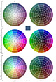 This Adobe Photoshop 7/CS file allows you to pick a base colour, and view variations based on colour wheels. With a couple of clicks, you can easily choose harmonious colours, and shading and saturation variants for hyperlink colours, background boxes, etc.
Instructions
Firstly, select a base colour for your scheme (always shown in the centre of each wheel).
Double click on the 'Colour Sample' layer, and change its colour to the base colour.
The colour wheels will now display a variety of colour schemes based on this colour. The uppermost section segment of each wheel shows variations in saturation and lightness/darkness for your chosen colour. The other segments show similar variations for related colours on the colour wheel.
There are two groups of schemes — saturated and desaturated. Pick either one, depending on your starting colour. Some starting colours work better with one scheme or the other, depending on the initial colour's brightness and saturation. Each scheme shows darker variants on the right, and lighter variants on the left, with three groups of saturation modifications:
- Top — no modification, just darker shades on the right column, and lighter shades on the left.
- Middle — the saturation or desaturation (depending on scheme folder selected) increases outwards from the centre of the circle.
- Bottom — the saturation or desaturation effect increases towards the centre of the circle.
Further modifications can be made to the overall saturation or lightness by using the top 'Vary saturation' layer modifier to lighten or decrease/increase saturation. Do not change the hue from this control.
If you have any comments, questions or suggestions for improvement, we'd always be interested in hearing from you.
Check out our other Photoshop Tutorial:
Photoshop Displacement Map Filter — how to use it for integrating text and graphics into a background or surface...
 Follow us on Twitter